Well, I said, after a victim [sorry, volunteer] asked for my thoughts on a recent piece of his work that I would do just that. So, I will get round to the piece he asked me to look at, and for which he wanted my critical appraisal. But before that a few words in general.
One of the characteristic phrases about being a teacher is, 'Having a duty of care'. In educational terms, related to the law, this implies that one should ensure 'your' students should be protected from injury and harm. I have no intention of going into this matter in any detail except to say what, over the years as an art teacher and lecturer, what it also came to mean to me.
 |
| Being Grumpy ... Bah Humbug! |
To me, and many other teachers, it also came to mean not just protecting from the physical, but also the mental injury and harm that can come about through the careless action, word, or words used that can cause some form of mental distress. I am not going to claim I was perfect, or that I always got it right, or that I wasn't guilty of such, but I always tried [I believe] to avoid saying, or doing, anything that could result in causing unwitting distress through any critical action on my part. So I have approached this 'crit' of the work below with a little trepidation.
 |
| Being deathly ... he he |
With that pontification out of the way .... and recognising that my thoughts on others artwork is not going to rock the world of fantasy Illustration, here are my comments on the work from my two ''volunteers'', that of Andy and Matt.
First - Andy ATOM Taylor. I'm not going to say to much here [sorry Andy :)] as the work I want to highlight is based on his interpretation of some of my own pieces. For example, the Dragon from '
The Warlock of Firetop Mountain'. First mine [copied by someone from the book I suspect] then his.
 |
| Andy ATOM Taylor |
There has long been a tradition by artist's to copy from others work, from the 'learner' to the master, [and I'm not calling myself anything other than someone who is in essence 'still learning'], it not only acts as an excellent training ground to examine technique, but also allows the 'copier' the freedom to explore the original work and interpret the piece, in turn, through their own ideas. What is nice about Andy's pieces is he has not just 'copied' but also 'interpreted' by adding his own individuality 'twist' to the work he has been examining. An even better example of what I mean can be seen in how he has 'added' to the original. Again, mine first, then his.
 |
| Andy ATOM Taylor : Wandering Monsters |
Note, again how he has added, and refined, as he has explored my work to give a freshness and vitality that makes his on a true homage, and not just a copy. Andy, who has decided [thank you] to become the 'curator' of my 'on-line' library, through down loading much of my work as he can find [wait till he starts looking for my work for '
Tracy' and
'Bunty' comic. lol] has told me how much he finds himself inspired by my stuff. Has to be told, in turn, how I find his 're-interpretations' refreshing, and to say how honoured I feel that he's taken the trouble to do all he's doing on my behalf. Thank you Andy.
When I first started out as an illustrator the computer had not yet revolutionised the whole concept of printing reproduction, most work relied on either film positives, PMT's [ Photo Mechanical Transfer], or engraving. In order to ensure good reproduction line work [in particular] the original had to be drawn [traditionally] one and half times the original size. You can see this on, for example, this piece from '
The Warlock of Firetop Mountain'.
The most important factor was to ensure good line without 'break up'. Now you might be fooled into thinking ...wait a minute there is obvious line 'break up' evident to be seen here, which is even more evident in this next example.
So what is going on? Was the original like this? No, it was not, nor the original printed version. What these examples suffer from is 'newer' printings, on not always good quality paper stock, which were not necessarily based on good quality copies of the original artwork. I've been lucky to see
Warlock printed in many different languages, and on many different types of paper, all which show clearly how copying from copies effects the quality of the printed images.
Now, I'm not implying that a sketchier appearing illustrative look would not reproduce, as you can see from this piece by the master English Illustrator Edward Ardizzone, but my contention that care should be taken to ensure the line used by the artist [illustrator] should hold in reproduction.
 |
| Edward Ardizonne |
Let us look at the work sent me by Matthew H. Damon for my next critical appraisal and compare it with, again say, a piece by Edward Ardizonne. First the piece by Matt, then by Ardizonne.
 |
| Matthew H Damon |
 |
| Edward Ardizzone |
But they are different in style so what's my point? Well, let us look at a close-up from each, but remembering that Ardizzone's is a reprint from the original and Matt's is a high quality jpeg. With Ardizonne you can see, even with poor reproduction, the line weight still 'holds' but with Matt's I'm tempted to think some of the finer lines will not.
Of course computer generated imagery has made some of my points irrelevant, but I'd still like to see even the 'sketchier' line work used by Matt drawn a little more carefully with more thought to eventual reproduction. See the same piece by Matt reduced as it might appear through reproduction.
Now I may be cheating a little here [actually I am Matt], but I hope we get my point, and recommend that Matt, who bubbles with ideas, tries to slow down a little so his work benefits from a little more considered care, which is much more evident in that of Andy's pieces.
But back to Matt and his drawing. Looking compositionally at the original there are other things that can be highlighted for some improvement, and as Matt, who is the first to claim he cannot draw, but is in fact a writer who has to do his own illustration, wanted me to help I have tried to be constructive.
First let me state that you can draw Matt, but like all of us you can still learn, and you can still improve. So here are a few visual pointers about the original piece. Mainly based on normal pictorial criteria such as composition, perspective, shading, visual decoration to create the illusion of a reality, and so on.
First, as a reminder, the original drawing.
Next, my analysis of some key points in the work, that I feel would benefit from fresh compositional consideration, with emphasis on perspective, shadows, shading, and textural mark making.
 |
| The perspective analysis in red line was to highlight a common error of not using one horizon line [or eyeline]. |
Now examine my 're-draw' where by adding a few key changes: such as only changing one stack of the boxes perspective; changing some of the shadow; the position of the body; some of the scaling involved in the body, including he head; and some bits of shading, the picture now looks the 'same' yet, I think, different, with the hope that my 'changes' will prove helpful.
So, if we compare the two versions, the original and the adaption [see below] ,we, hopefully, can see what I meant, and that my 'short' critical analysis will prove of help to some.
Catch more of Matt's work, and ideas, at his website:
http://www.roguedreampress.com/
where you will also find how the original work came into being before I 'fiddled' with it.
So there we are, and as mentioned, I hope some of my pointers may prove of value. Finally, to finish, thanks once again to Andy, an oldie but a goodie from my past.


 The most important factor was to ensure good line without 'break up'. Now you might be fooled into thinking ...wait a minute there is obvious line 'break up' evident to be seen here, which is even more evident in this next example.
 So what is going on? Was the original like this? No, it was not, nor the original printed version. What these examples suffer from is 'newer' printings, on not always good quality paper stock, which were not necessarily based on good quality copies of the original artwork. I've been lucky to see Warlock printed in many different languages, and on many different types of paper, all which show clearly how copying from copies effects the quality of the printed images.

 Now I may be cheating a little here [actually I am Matt], but I hope we get my point, and recommend that Matt, who bubbles with ideas, tries to slow down a little so his work benefits from a little more considered care, which is much more evident in that of Andy's pieces.

 Catch more of Matt's work, and ideas, at his website:http://www.roguedreampress.com/


This is a really interesting and useful post, Russ, thanks. And thanks to the artists for sharing their work and allowing it to be discussed in public.
ReplyDeleteOMG Russ--- thank you so much for reviewing my work... absolutely spot on, and I'd like to steal your revision for my book if possible (and hire you to revise some more drawings if it's worth your while to get in and do some tweaking)!!! Those very minor changes literally change the entire piece and make it soooo much better.
ReplyDeletethis was my first drawing with my Wacom... I'm getting a bit better with it, though I still don't know how to make sharp, dark lines... (maybe I should try a 'pencil' channel and 'ink' channel??) those light gray sketchy lines are the way i sorta figure out what the hell i'm doing... that process takes a long time.
i knew my perspective was a little off but had no idea how convoluted it was-- and that one stack of boxes you changed really changed everything. many many thanks... i owe you dinner when i come to London!
Wonderful to see an old hand giving constructive criticism. An entertaining and instructive post. And well done Matt for being brave enough to submit your work to Russ' scrutiny.
ReplyDeleteThis is brilliant and very helpful. Especially the quality of line bits.
ReplyDeleteI wonder, are you saying that the marvelous character of those breaks in your lines are due to reproductions of the pieces? That the originals all contained solid lines at those points?
I await more with baited breath. :-)
thanks austrodavicus-- it was no sweat for me.. as I told Russ, I'm not a real illustrator, I can just draw 'better than everyone who can't draw'. haha... it's a gigantic, surreal honor for me to get critiqued by my all time favorite illustrator since childhood. and I learned a ton from this brief demonstration so, absolutely wonderful experience.
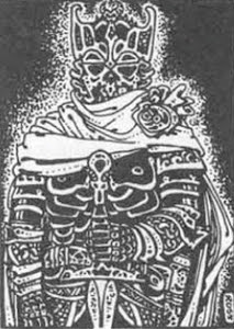
ReplyDeleteI really love how you enlarged the corpse's head and contorted its jaw, btw Russ-- great touch!
Fascinating stuff, Russ. I'm not in any way an artist - I draw somewhat less well than a typical 8-year-old, I feel - and yet this is great insight into the technical aspects of the craft. I'd love to see more of this type of stuff, if it's not too time-consuming.
ReplyDeletePaul.
Fascinating observations. Its always the fundamentals that take the most time to learn. As I am finding out... =(
ReplyDeleteFantastic and lethal looking critter too!
Right ... a couple of replies to those who commented [for which, thank you].
ReplyDeleteTo Matt.
First, I'm pleased that you found my comments of value. I'm no expert on a Wacom [you need to ask someone like Paul McKenna, who is a nice guy, but very busy] but pressure does make a difference. Do have a look at your pen settings. I agree about the length of the process, I suspect you have to have the right 'mind set', but maybe that's lack of 'training' on my part. As for paying attention to your perspective, you'll be amazed how improved your pics will look.
To -C,
No, my lines have always been broken in places. I like doing it [personal choice], and think it adds both 'tone' and 'space' to some of my work. My point about loss of definition, through printing, was because finer lines do tend to suffer with bad reproduction and this is, to me, especially obvious with my broken line areas.
To the others, can I say your response makes it all worthwhile. As I wrote I was concerned about doing such a critique. So I'm pleased it has proved helpful. Oh, and Matt, yes you can have a copy of my version with its changes.
Awesome artwork as usual, Russ!
ReplyDeleteBTW. While browsing through some old boardgames I found one that had some really cool illustrations that were strongly reminiscent of your style... did you illustrate the cards for a 1980 Games Workshop game called "Warlock"?
Thank you Russ and of course thank to the artists Atom and Matt ! Your 'critics' are very helpful, I really hope their will be others such teaching analysis ! I didn't really care about the lines transformation by reproduction and printing till I read your post..
ReplyDeleteWell I don't think it will be hard for you to find other 'volunteers' if you need some, your critical appraisal are very constructive and done with an obvious kindness...
It's 'funny', I did respond to your post earlier Jiminy, but that appears to have 'vanished', and not through my doing.
ReplyDeleteAnyway, to repeat. Yes, I did design the playing cards for the boardgame, "Warlock", put out by Games Workshop. In truth they were a hit and miss affair as they had to be drawn close to print size if memory serves. I have an old box myself somewhere, but have not looked at it in years. For those completists, I also worked on a "Doctor Who" game about the same time as well.
Thank you all for your feedback on this post, maybe I will re-consider and do another crit at some point. Especially if I can find something 'fresh' to say, but not till after Christmas I think. But anybody who is willing to 'volunteer' work with specific 'problems' they'd like Ol'doc Russ to diagnose .... [about then] do consider submitting your work. But, I cannot make promises.
Speaking of Warlock... the Adventuring Party have actually just reviewed it - and they like it! Coincidence? Spooky.
ReplyDeletehttp://theadventuringparty.libsyn.com/con-september-2011-warlock-conspiracies
mmmm ...seems that link is being updated [or so it claims] but we suspect warlock leprechauns, ah, so we do.
ReplyDeleteBut you peeked my curiousity Jiminy, so for those wanting more detail here is a link ... http://boardgamegeek.com/boardgame/2146/warlock
...and as far as I recollect I designed and drew the playing cards.