Wednesday, 14 July 2010

Brush and ink

Time does fly, and as I see it's been a while since my last post I thought I'd 'catch up' as they say. This feature is primarily about brush and ink work rather than that done with a pen.

As I remarked in my last post, I was comic artist for a while in the UK. I did not work for boys comics [mainly because I wasn't asked] but girls both weekly and in annuals. The comic market for a long time in the UK was dominated by two companies: DC Thomson [of Beano fame] and IPC, formally Fleetway, [of 2000AD fame]. I was introduced to the world of drawing comics through a comic artist, Ken Houghton, who ran a comic artist evening class at a school where I taught Art & Design. He was a lovely patient man, a very good teacher, who died too young, and is missed by those who knew him. One of his other students at that time was a very young 16 year old called Sean Phillips who has since risen to be a well known comic artist working these days for for Icon, an imprint of Marvel Comics [Criminal], and Marvel Comics [Marvel Zombies]. {updated thank to Dave Morris}.

Most of my comic work was done for DC Thomson, which although it still exists with its headquarters in Dundee, does not have the comic output it once had. Titles that I worked on included Bunty and Tracy [I've yet to meet anyone who actually admits to reading such comics]. For IPC I had the chance to work on a couple of pieces for a comic called 'Misty', including, in full colour, one of their annuals. Although in the case of the annual strip I had the same problem as I had with the Robin Hood game book, to make the creatures 'recognisable' as Hammer Horror 'types', but not so much anyone could sue. Still it was fun.

The actual comic process involved being given x amount of pages [usually three] and what was called a 'panel' script detailing scene setting and dialogue spoken, they were similar to radio and film scripts in many respects. You had some freedom about layout but always had to leave space to accommodate the 'speech' balloons. You were given roughly two weeks to complete each weekly segment and not expected to miss any deadlines. If possible it was sensible to create a backlog in case of accidents or incidents. The worst was while I was working in Papua New Guinea, when six pages were lost in the post and I had to redo them fast. I've often suspected it was wasn't the mail that lost the work but a counter clerk at the post office, who just took the stamps as a 'finders fee'. After that incident I always ensured to watch the parcels being franked, and funnily enough, nothing like lost artwork ever happened again. Strange.

In those days, none of the original artwork was ever returned and I only have a few comics, which I bought myself [now somewhere under piles of other stuff ] and poor photocopies that were given to me for 'character continuety' to remind me of the work I did. At the moment I can only find a a couple of bits of photocopies, and they're in poor condition, to show examples of that working period. I've 'cleaned' them up as best I can without too much loss of detail, but they're not great, however, as examples of  brush work they at least show the difference from dip and technical pen.

From the look of the strip parts shown below, the first was done for Bunty and the next two forTracy [but I could be wrong [as usual].

So, there you go, a couple of examples of brush work. For those who like more detail they were drawn with an HB pencil and brush inked [except panel borders] with a Windsor & Newton series 7a sable brush size No. 2. A brush that is sadly no longer available, yes they still sell a Series 7 but it's not got the hair length or handling of ink quality of the 7a series.
By using ink of course, even with careful cleaning, you went through brushes like a dose of salts. Well I did . Why do companies often 'cancel' excellent tools for a weaker variant? Barmy I'calls it.

On an aside.
I did do one item, in brush and ink, for a competition run by Marvel Comics, involving the Hulk where you had to write, draw and think of an idea of a 'what happened next' scenario, in their [now defunct ] magazine called FOOM. I'm very vague on the detail now, but the prize was lots of Marvel 'goodies' and I considered it might act as useful 'try out' as it was supposed to be judged by an artist and an editor back in the States.  I had thought my entry had come to nothing until a year or so later, when a friend remarked in a letter about how pleased I must have been for 'winning' that competition. This was a real surprise as I heard nothing since I posted of the art page, so he sent me the relevant copy of FOOM, where I read how excited [?] I was to have been the winner of the competition, and to have received all those 'goodies' as prizes. So I contacted Marvel and asked about where all my prizes were as I'd never heard from them at all - I received a cursory note from some editor minion and four old copies of FOOM  [including the one that said what wonderful prizes I'd received]. Even to this day that shoddy behaviour rankles. [Altogether now.... Ah, sad little you.] My opinion of Marvel has remained little changed since such treatment. [Ah].

Thursday, 1 July 2010

Scene on the Road

First, a big thank you to all who have decided to follow my blog about my artwork.

I have 'cracked' the 100 followers, wow, and I feel like a jet pilot of yore when the sound barrier was first broken [little tear in eye!] a momentous event at the time.

What twaddle - I do however wish to commemorate the event in some way and have dug out a parcel of stuff for future posts, but in the interim  - I thought, what can I use to 'mark' the event [and my birthday]?

The following post is to mark that event and 'show' an example of work that I couldn't find a reason to post. I found this piece had been posted online by someone and I always wondered what became of it, and the other work I did.

Many moons ago I was not only a fantasy artist, but a general commercial one, and worked on lots of stuff most of which is long forgotten. Among those 'jobs' was my being a comic artist in the UK, of which I'll soon post a couple of cobbled together photocopies of originals [as examples] for you to see. It's not exciting, but it will give a 'flavour' of the sort of work I did.

I also did work for the occasional magazine. One of these was a magazine called Penthouse, if you don't know what Penthouse was, or are under 16, please cover your ears now!

The feature was called 'Scene on the Road'. It was to be a saucy piece, ala Donald McGill, which showed each month, a different 'Scene on the Road' - each which would feature a different UK road sign. It was fun, but didn't last long [not raunchy enough].

Donald McGill was for many years the 'King' of the British seaside 'saucy' [some might say vulgar] postcard, who was actually put on trial as a purveyor of pornography [in the early 1960's I believe]. Although he was prolific in his output I doubt he made any 'real' money from his work. There is a 'quality' about his work that says it was as much a labour of love, and I know from an Australian friend back in the 80's who thought he'd design some traditional cards for the South Pacific market that for each card he sold he would receive about 1.3 cents [and that's Australian dollars not American].

Anyway, here it is ...
If anyone is interested in the work of Donald McGill I've made a link to an excellent article by George Orwell on the subject of McGill and his work http://www.netcharles.com/orwell/essays/donaldmcgill.htm [and hopefully got this right] .

For those interested, this is an example of Pen, Ink & Brush, coloured using Dr Martins concentrated watercolours.

That's all folks, till another day.

Saturday, 26 June 2010

Pen & Brush

So, what about pen and brush? The problem is as much about where to start.

What is relevant? I suppose the best way is to 'show' examples of different work, in different mediums, and on occasion, different genres. Certainly different Fantasy RPG genres.

This post will appear in 'parts' as I find time to show work examples over the coming days.

Over the years I have used a variety of media in  both black & white and colour, but the mediums I intend to discuss are mostly to do with print reproduction. In days of yore, pre-computer generated art the most common tools for B/W artwork was traditional dip pens, brushes, pen and brush combined or technical pens and occasionally felt pens. The artwork was generally done at 1 and a 1/2 times reproduction size [though their were exceptions] and on good quality Bristol board of various types. In some ways it was the board used that could make the difference to the quality of the image and it was something everybody strived to find. Today, a lot of those boards, and the companies that produced them [certainly in the UK] appear to have 'gone', mores the pity.

Of course the paper chosen for the books also has a huge 'effect' on the quality of reproduction. No matter how 'good' your work, if it's printed on upgraded toilet paper ...
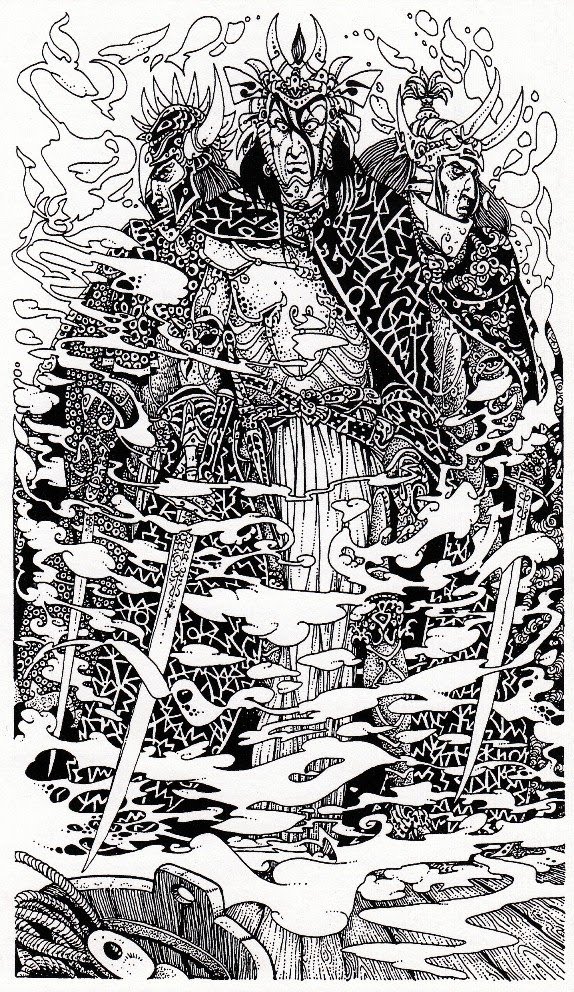
OK. Let's look at a few pieces - it is not necessarily what I'd qualify as 'good' work but it does 'show' examples of different types of B/W work. Here we have traditional 'dip' pen and ink.

This particular illustration was produced for a 'different' game book by Puffin back in 1987. There were two books produced in the series Robin of Sherwood and each book tied in with the television series. The most amusing thing I can remember from this particular job was Puffin wanted any character that appeared in the Television series to be drawn as accuratly as was possible in the illustrations, but at the same time, also made me sign a contract with a disclaimer that basically stated I was not allowed to show an accurate likeness as I could be sued and in the wording of the contract Puffin denied all responsibilty. Simply put - match any TV actors likeness [if they appeared in any illustration] but not so anyone would say, 'that's so and so!'  Luckily, they hardly featured in the pictures I had to draw.

As an aside - note [if you're not already aware] the choice of scene to be illustrated is very rarely the choice of the illustrator.

A couple of examples of technical pen now. Over the years I've used a variety of makes, and pen sizes, My favourite pen [sadly long gone] had a nib that was so 'worn', it had a bevelled point, which made using it a pleasure.

In the following, each of these examples show a slightly different approach to the use of pen though some would say, 'in your dreams'.
This first was done for a short story in a Fantasy anthology. The next for one of the FF fiction titles I worked on.

The next for one of the later FF game books.


 Next another game book.
 And the last [for present] two showing different 'styles' from The Fabled Lands series.

Lastly, a quick mention about Citadel Miniatures, which had a nice little mention, or at least a 'dwarf' figure did, in Daddy Grognard's excellant blog. The mention of the figures reminded me that some of the earliest figures are actually based on my some of my drawings. They kindly sent me a sample at the time and somewhere in my 'attic' there they still sit.

Next post will contain some old pieces .... and other stuff.

Sunday, 13 June 2010

Worlds 2

It had been my intent, in this post, to show examples of different types of pen and brush work, but I came across some more visuals that I did as background to the world of The Shadow King and thought it sensible to post these first.
My task, outlined by Dave Morris, was from his original scenario, to [roughly] visualise images to represent London at the turn of the 19th Century, not of our timeline, but one where the world had been changed by a series of events resulting in a city not as written about by such as Dickens, or Verne, or seen by that master of line Dore but a darker world one where our legends and myths have some credence. This ultra-Gothic world, as envisaged by Dave, is a place of death and dread, its background one where a vampire blight had hit the world with it's 'centre' in London - this was to be the world of the Shadow King.
Most of my visuals are fairly crude, drawn in felt pen with added wash, my intent was to give atmosphere as much as 'show' different aspects of the place. 


But as I became immersed in the idea of this London, I began to imagine the world beyond, what methods of transport, by rail; by river; by sea; and by air would apply - what differences would have come about, especially as a result of vampire domination?

Where possible, it was my intent to rationalise this world, and to make links through scientific and engineering progress that had their historically similar antecedents mirrored in our world. But here, in this timeline, where the date is roughly 1896, things had, in some areas, progressed faster and in a grander scale. I suppose it's really a variation on steam-punk, thus we 'see' the development of airships, which stuttered to a halt in our own world. It's hard to read [sorry] but the airship docked in the picture below is named the 'Santos Dumont' an early enthusiast of airships.

Of course their had to be costumes: next - a couple of example 'pages'.
 Those of you who love gaming might wonder why you've never seen this game, especially as it was conceived nearly twenty years ago [how time flies], though I've seen similar ideas since. Dave Morris, is the man to ask, and if I've got anything wrong Dave, such as when we worked on this, I apologise.

Sunday, 6 June 2010

Worlds

Worlds. One of the interesting aspects of drawing is to attempt, when possible [as some illustrative tasks demand otherwise], to 'flesh out' the subject of the picture to show something of the 'world beyond'. I'm not professing to be good at it, but it's something I like to do.

After the Fabled Lands series was cancelled by Macmillan [Pan Books] after only six titles, instead of the planned twelve, Dave Morris and Jamie Thomson decided to look for other directions. Dave has since gone on to, among other things, work, with Leo Hartis,  on his graphic novel Mirabilis - Years of Wonder, and his Fabled Lands  blog site.

One of the earliest creations that Dave and I worked on as a possible game scenario was The Shadow King, and I was given the task of roughing out [and they are rough, lol] a few scenes to show the world of the Shadow King, which was to be set at the turn of the 20th Century in an alternate London.


The other world scenario was that of Abraxes, the Fabled Land. Abraxes was, as you'll see from the map that I drew from Dave's rough, a large island where different peoples lived. The key cities of each race had its antecedent's in races that once inhabit our own world. Thus there are hints of Egyptian, Assyrian, Toltec peoples, among others.

Here is the map of Abraxas - The Fabled Land, and a few of the sketches I created to try to visualise the land of Abraxas.


I also had to come up with the creatures [from Dave's written descriptions], and create my own costume designs, and so on, that would inhabit this world.


Before finishing, a special mention for Andy, who has gone to all the trouble of identifying the published source of the illustrations I have posted on line to date.

Tuesday, 1 June 2010

Flaming June.....

Flaming June; it's raining outside so that sounds about right. Nobody has taken me up on my offer of showing 'other' work, such as non Fantasy [I don't have much ready to post anyway] so let's see what's still in my art file at present. From Fabled Lands a couple I missed out.

From the Fighting Fantasy series.

Update: thanks to Andrew [see his post] he's been able to identify where the following three illustrations came from. Much appreciated! All I can add is, well, one was from the FF series.


The Dragon of course comes from 'Warlock'. I liked him, still do but of course his wings. Just a wee bit short, or small, really. But here's the real lowdown. You heard it here first. He comes out of his cave, he pumps his wings full of blood, and a dash of magic, and they swell and spread, like a butterfly. After all, it would be really dangerous to have fully developed wings in a cave. Don't believe me? Check out Renaissance paintings, they knew.